Tagged: history Toggle Comment Threads | Keyboard Shortcuts
-
davidwills 1:28 am on July 9, 2011 Permalink | Reply
Tags: art ( 28 ), Barney Bubbles ( 153 ), Chilli Willi ( 5 ), Colin Fulcher ( 39 ), design ( 37 ), Elvis Costello ( 15 ), Graphic design ( 17 ), Hawkwind ( 7 ), hippie ( 5 ), history, jake riviera ( 18 ), new wave ( 17 ), Portobello Road ( 5 ), punk ( 16 ), Quiver ( 4 ), Rock and Roll ( 3 ), Rolling Stones ( 6 ), The Attractions ( 6 ), Twickenham art school ( 5 )I just found thisWhich means it’s probably been around a while. ‘Tis a view of much of the Colin Fucher (AKA Barney Bubbles) ouvre, I could correct one or two things in the biography, but a it’s good show and worth a visit. -
davidwills 6:44 pm on July 6, 2011 Permalink | Reply
Tags: A1GGz ( 5 ), chris higson, David WIlls ( 19 ), history, Keith Richards, new wave ( 17 ), old newspapers ( 13 ), Rolling Stones ( 6 )Keith Richards and his lot lived in Edith Grove down the road from us in Peterborough Road
Been reading the brilliant ‘Life’ by Keith Richards. Seems as how Keith and Co, The Stones, lived over in Edith Grove, Fulham, in 1962. Well, my flat-mate Chris Higson went to a party there, “Scored.” whatever that meant. They lived just down the road from us. We lived on Peterborough Road in Parsons Green where Higson, Mick Jackson, both illustrators, John Steele (for a while), and I, graphics, lived with cardboard walls and a mould problem. Plus with Nook and Jim Bunker at one time for a bit, when she was pregnant with Zoe and wanted by the cops as a runaway from Staines. I lived there in 1961/2, real taters, coldest fucking winter since ever. Like Keith, we sold beer-bottle empties we found littering the floor and crevices of the ugly apartment the morning after the night ‘afore. Sold ’em back to the off-licence, got enough, about 3s/6d (3-shillings and sixpence) for a bacon sandwich and a cuppa in the morning at the Station Caff.
(There’s a photo in the Box of Tricks by me of Higson and a Tiger scull.)
-
davidwills 4:39 am on July 6, 2011 Permalink | Reply
Tags: art ( 28 ), Barney Bubbles ( 153 ), Colin Fulcher ( 39 ), design ( 37 ), Hawkwind ( 7 ), history, new wave ( 17 ), Quiver ( 4 )The glossy, brightly coloured illustrations by Denis McLoughlin in the Buffalo Bill Wild West Annual
The glossy, brightly coloured illustrations by Trent Magreggor ? (no – see below) in the Buffalo Bill Wild West Annual of 1958 were a big influence on Colin Fulcher. I’d been looking for the artist for a while and came across the reference to the book in Kieth Richards’ book ‘Life.’
davidwills is discussing. Toggle Comments
-
davidwills 4:52 am on July 6, 2011 Permalink | Reply
I think the editor was John Groom, but who was the illustator?
-
david wills 5:11 am on July 6, 2011 Permalink | Reply
The Comic Art of Denis McLoughlin No. 1: A Comics Monographs Special Issue ~ Book ~ Stated first edition, 2007. Perfect bound, 102 pages including covers, illustrated in black and white.
-
-
davidwills 11:49 pm on July 26, 2010 Permalink | Reply
Tags: Barney Bubbles ( 153 ), design ( 37 ), history, music ( 5 ), Portobello Road ( 5 )Aten sends a scan of his dad’s painting for an Indian restaurant
Barney Bubbles’ son Aten Skinner very kindly sent us this scan of his dad’s work, for which we all thank him sincerely. Aten said, “Hope the viewers like it.”
I know nothing about the history of this painting other than that it was painted by Barney for an Indian restaurant in London. I would guess it to be painted about 1974. I could make up a story, about how Barney paid for a vindaloo and popadoms with this painting, but I won’t. If any astute reader, and there are many hereabouts, has any other knowledge, please do tell.
davidwills,
acrobat reader x pro,
Lia, and 1 other are discussing. Toggle Comments
-
R and M 10:02 pm on July 28, 2010 Permalink | Reply
A BIG thanks to Aten for sharing this. It is great to see it.
Visually it feels really close to the 1974 Hawkwind tour programme Barney Bubbles did; the background in particular is an exact match. The tour programme was featured on this blog a while back. To save everyone searching and searching, here’s a link to it so you can make the comparison. https://davidwills.wordpress.com/2008/12/06/mucha-blonde-in-bbubbles-heist/
So David, your 1974 date for this painting is probably a good guess.Very interesting to see a BB monogram on this, given the whole ‘anonymity’ thing Barney had going on.
-
Lia 4:00 pm on July 30, 2010 Permalink | Reply
Thanks and hello to Aten. I first met Barney when he stayed at out house in San Francisco. In those days we spent a lot of time at the Avalon and the Filmore but one summer evening we came up with a recipe for Sara Seagull (Barney’s name for me in those days) Soup:
1 c orange juice, fresh
1 c yogurt
1 pt fresh strawberries
sugar to tasteBlend ingredients.
The first smoothie?The recipe was published in 1971 in the vegetarian cookbook, The whole Wheat Heart of Yasha Aginsky by Carrie Rose (E P Dutton)
-
davidwills 4:16 pm on July 30, 2010 Permalink | Reply
Hi Sarah, and thank you so much for the interesting food item. If you have any more memories to tell, a thriving industry of Barnologists is awaiting your every word.
We are particularly interested in who Barney met in San Francisco, and what he did when out and about. I particularly recall his delight in the sweet (candy) wrappers he saw. But he was not impressed by the creativity of the light shows he worked with. They were nowhere near as advanced as he was, his freewheeling approach to the art took him places they thought not true to the form. If he could do it, he did. Anything is of interest – our readers are fanatics.
Wiki and others say inaccurately that Barney was influenced by Mouse and Kelley, not true. They were stuck in an old rut as far as he was concerned, nothing to learn from them. They were reshuffling old ideas that had already been done. Mouse (or was ir Kelley?) went back to the US and told John Goodchild who was at that time working at Rolling Stone, that Barney was just another scraggy hippie. (possibly true if you saw him, but hidden under that hair was a noddle of gold.)
(I wrote about much of this somewhere back in the older posts.)
-
-
David Wills 5:12 am on August 22, 2010 Permalink | Reply
Hi Folk
David Wills tells tales: I’m out here in the wilds of Clayton Street, far from the old folks at home on Ashbury. All the folk are sad and weary,.. sod that. We havin’ fun. Bought me a new wooly zip coat from Tibet, warm enough to heat a witch’s. Cat Bell and Richard my hosts like my green tomato, cabbage and baked tofu, no roots (Jain influence), vegan soup, with artisan bread. I hear that the seventeen-year-old, fair-haired willow pattern Aless (she’s making a movie today) and Lynn the fabulous tip-typist poet are whorling away on the paperwork for our 10 10 10 International Binary Day at the Ashbury-Haight Block Party. The bands including Lynn and the Thunderground, The Jug Town Pirates, Galaxxy Chamber, and the Screamers All the homesteaders on Ashbury are for the block party. I know, I asked them all. This approval is important ’cause the city wants to know that we have the OK of the nabe. And we do. -
acrobat reader x pro 2:28 pm on January 7, 2013 Permalink | Reply
Hey may We reference some of the content present in this entry if I web page link back to you?
-
davidwills 9:51 pm on January 7, 2013 Permalink | Reply
sure
-
-
-
davidwills 11:51 pm on March 19, 2010 Permalink | Reply
Tags: art ( 28 ), Barney Bubbles ( 153 ), Beatles ( 2 ), Colin Fulcher ( 39 ), David WIlls ( 19 ), design ( 37 ), Graphic design ( 17 ), history, Muleskinners ( 2 ), Rock ‘n roll, Rolling Stones ( 6 ), Sixties ( 2 ), Small Faces ( 2 )A Neighbor on Avonmore Road looks quizzically at lens
This girl was a part of the roadside audience while painting our psychedelic bus in 1967.
Photograph by David Wills. -
davidwills 1:18 am on December 4, 2009 Permalink
Tags: Barney Bubbles ( 153 ), Colin Fulcher ( 39 ), David WIlls ( 19 ), hippie ( 5 ), history, new wave ( 17 ), old newspapers ( 13 ), Underground ( 14 )The ‘Sounds good evening’

Photograph by David Wills Copyright 2011.Here the jolly fun at Leigh Court is captured during the Sounds Good Evening in 1967 in a photograph by me. Various folk are recognizable, but many of the names are a part of history that escapes me. Lower right is Jenny, the football (soccer) poet, Crispin’s amour. Jenny and Crispin are still an item, living in Spain I think. No doubt some of these good people will bless us with their mems of the occasion. More than that I’m lothe to conjecture, maybe more words will come as I sleep on it. Was that a good time or what? This was the time we lined the flat in plastic to avoid a repeat of the flying pastry dough on the carpet. It was the primer for all parties that followed.
It is an irrefutable fact, acknowledged by all, that the future Right Honorable Lady Wordsworth, with or without spectacles, is nowhere to be seen in this assembly.
davidwills and
Michel are discussing. Toggle Comments
-
Michel 2:05 am on March 8, 2011 Permalink
The girl with the head-scarf at lower right is Patricia Kinsella who worked as Barney’s assistant for a while. I’m still in touch with her and know she will be astonished to see this!
-
davidwills 4:10 pm on March 8, 2011 Permalink
… the Lady Wordsworth would again like to emphasize that is most certainly not her in this shocking picure, either, so she says.
Those pictures of the Stones(?) on the wall were lent by Ginny Clive-Smith at Conran.
I look at this picture and again see the influence of Warhol’s Factory at work here. No speed-kills use here, a few of us smoked hashish-in-tobacco joints. Though this was later to change for Barney to frequently daily LSD use from 1969 on. Wild. Seemingly licentious times, but not really licentious, too suburban for that. Compared to the average goings-on about town we art students and kin ruled a wild world of boss art activity that echoes on yet.
In San Francisco I once interviewed a prospective room-mate who was a 4 year participant in the army Co-intellpro (Sp?) tests on the effects of long term acid (LSD) use. It wasn’t pretty, I didn’t rent to him.
-
-
davidwills 9:08 pm on November 17, 2009 Permalink | Reply
Tags: A1GGz ( 5 ), art ( 28 ), Barney B ( 3 ), design ( 37 ), history, invention of the webMay 1983. “Yeah. These are for you, don…
May 1983. “Yeah. These are for you, don’t know what you’ll do with them, but I expect you’ll think of something, right?. Collage maybe?” said Barney when he gave me these old prints I’ve been posting lately. And that’s why the web was invented – to make possible their publication. They were in a box full of print tests. left over from some project way back, late ’67 or later. We were going to do a show of the influence of the A!GGZ,as an art project A1GGism, but it dissipated as an idea to do as 1969 wore on. I was unhappy with the prints and Barney wasn’t interested in the Mega Jumble sale that I was into. I’d made the prints over at the Fulcher family house enlarger in Colin Fulcher’s, aka Barney B’s, temporary darkroom on Tranmere Road, Whitton. Most of the negs were mine but the Muleskinners and the grad pix were photographed by Colin. In a way this is the continuation of the work barney and I started in ’63 and prepared for in ’67, to art-up a multi-media AiGGz show in the ongoing sequence of ‘Inspector Burge Investigates,’ the Image poster, the Erections and the Super 8 ‘music video.’ These pictures were intended as images for an A1GGz Poster and box, to contain the Ultimate.
I’ll work this into a post I think. -
davidwills 5:02 pm on March 31, 2009 Permalink | Reply
Tags: art ( 28 ), Barney Bubbles ( 153 ), genius, Graphic design ( 17 ), hippie ( 5 ), history, music ( 5 ), new wave ( 17 ), punk ( 16 )Blimey – Barney Bubbles!
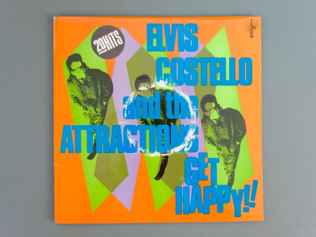
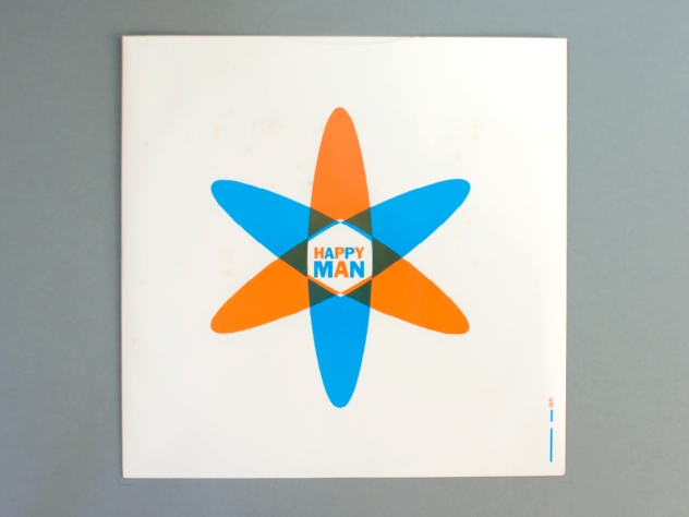
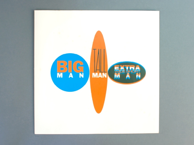
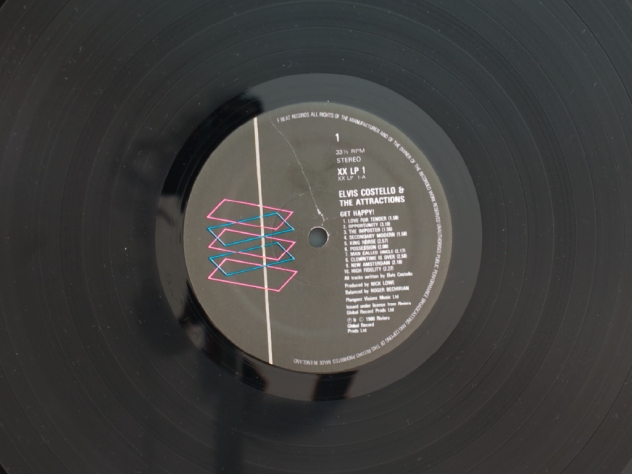
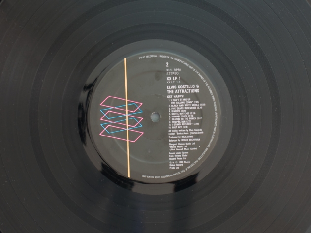
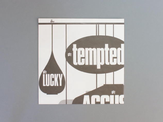
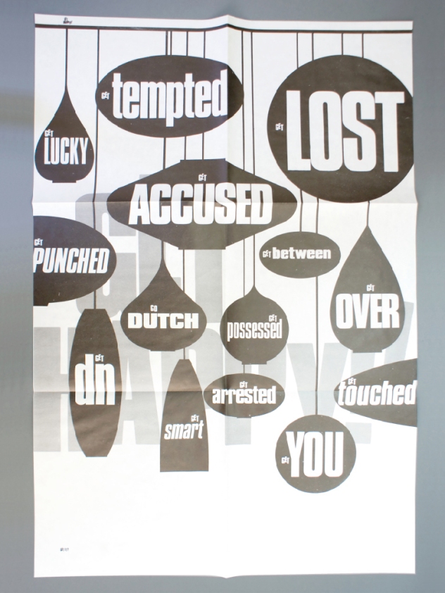
David Lowbridge who sent us these nicely imaged sumpturies says: The reverse of the inner sleeve (shown above) with three different shaped/sized ellipses is entitled: ‘BIG MAN’; ‘TALL MAN’; ‘EXTRA WIDE SHORT MAN’.
Long-time reader Steve Kirkendall writes:
Hi David, Hope all is well. As promised, here’s some words about why I’m a big fan of Mr B, with a little story about my fave Bubbles-werk.
Blimey – Barney Bubbles!
Barney Bubbles was a major influence on my work as I made the transition from illustrator to full blown designer in the early eighties. As we all know, he was incredibly versatile, moving from one style (and medium) to another, often employing styles that other designers would base an entire career upon, but which he would use to make a graphic statement, then move on.
My favourite Bubbles-werk would have to be his Elvis Costello packaging. And because I was such a huge EC fan, the music became the soundtrack to those wonderful graphic trips Mr B would take me on, as I stared at every detail of the sleeve design. And the press ads, posters and buttons for EC and the A’s carried the same level of invention and attention to detail.
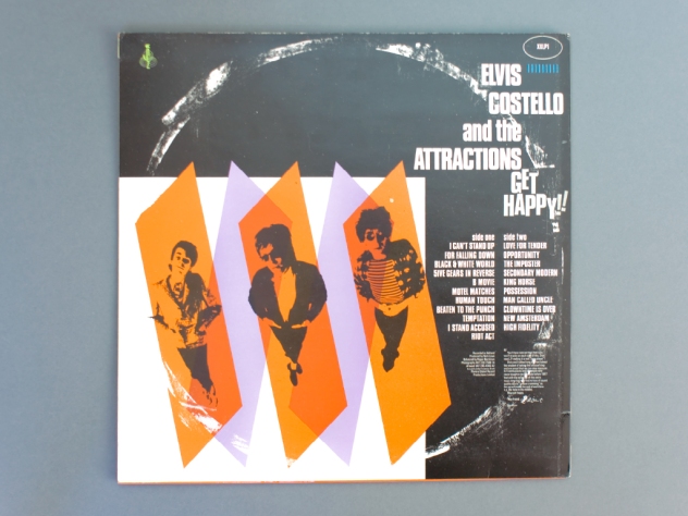
In the face of stiff (no pun intended) competition, my personal choice of top Bubbles graphism would have to be the the sleeve for ‘Get Happy’. It is the only piece of graphic design that made me stop dead in my tracks and utter ‘Bloody Hell!’ out loud. This was swiftly followed by a speedy purchase, then back home to listen to the album and more importantly, drool over the sleeve. The reason this piece of work stands tall above any other Bubbles output for me is that scuff mark on the front. (Although, my not-entirely-reliable memory seems to tell me that there was a larger, 12″ sized, scuff on the reverse too).
Genius is an over used word, but if Barney Bubbles wasn’t a genius, who was?
•••
David Lowbridge says: Yes, there was 12″ scuffing on the reverse too — be interesting to hear any recollections of the reaction this got at the time, any returns for instance!? This is the record where Barney used VAT numbers for the credits:
Photography VAT 239 7568 14, Artwork VAT 245 4945 42
Barney Bubbles | Le Journal de Jane,
David Lowbridge, and
rebecca and mike are discussing. Toggle Comments
-
David Lowbridge 6:26 pm on March 31, 2009 Permalink | Reply
Yes, there was 12″ scuffing on the reverse too — be interesting to hear any recollections of the reaction this got at the time, any returns for instance!? This is the record where Barney used VAT numbers for the credits:
Photography VAT 239 7568 14
Artwork VAT 245 4945 42The reverse of the inner sleeve shown above (middle image) is also great with three different shaped/sized ellipses entitled: ‘BIG MAN’; ‘TALL MAN’; ‘EXTRA WIDE SHORT MAN’.
-
rebecca and mike 9:03 pm on April 16, 2009 Permalink | Reply
strangely enough, in the book ‘Reasons to be Cheerful’ the outer sleeve of the Get Happy LP is shown, but the fake ringwear on the back has been photoshopped out! (it’s been removed). there’s probably a funny story in that somewhere 🙂
-
David Lowbridge 10:15 pm on April 16, 2009 Permalink | Reply
Crikey… not spotted that!
Strange really as, in my humble opinion, the scuffing on the back looks slightly ‘mannered’ (you could equally say ‘deliberate’) in comparison to the front — the way the scuffing breaks around the E of ‘ELVIS’ for instance. Small detail, and maybe I’m missing something, but…
-
rebecca and mike 6:55 am on April 17, 2009 Permalink | Reply
it’s interesting to note what happens in the advert Barney did for this LP. the design incorporates a pic of the front cover, but it is shown without ringwear. this is a nice touch as it helps make the fake ringwear more believable when you come across actual copies.
a similar thing happens with the press packshot for Elvis Costello’s ‘This Years Model’ (another sleeve Barney designed); most of the time a properly cropped version of the sleeve gets used (as opposed to the mis-cropped version with printer registration marks appearing on the front – as per the actual sleeve design).
-
David Lowbridge 7:21 am on April 17, 2009 Permalink | Reply
Very interesting to hear. Is that deliberate with ‘This Years Model’, the corrected packshot I mean? Always thought it might have been ineptitude/ignorance on the part of whoever is re-releasing it.
I wonder if the cassette tape release (if there was one) of ‘Get Happy’ omitted the ringwear too, or had two lots where the spools would be!
-
rebecca and mike 8:00 am on April 17, 2009 Permalink | Reply
when we talk about the packshot used for ‘This Years Model’ we’re not talking about anything in relation to re-releases, we’re talking about the picture of the LP cover that was doing the rounds in most press and magazines for the purposes of illustrating reviews and chart positions etc (and even some retailer promotions). we’d like to think distributing a ‘corrected’ packshot to third parties was all part of the grand plan! on the adverts Barney did for ‘This Years Model’ no packshot was used, although the photo of Elvis-with-camera was used as some kind of approximation.
the ‘Get Happy’ cassette? that’s a whole different story… we’ll give pics to David Wills to post up on this (his) blog.
-
David Lowbridge 8:35 am on April 17, 2009 Permalink | Reply
Understood… look forward to seeing the cassette.
[It’s indicative of the games being played that I often feel the need to couch the language I’m using when taking about BB work — using alot of ‘scare quotes’ too. The fact that I feel the need to phrase things in a certain way, which I’m sure I’m not alone in, says alot about the effect of the work and its different layers of meaning.]
-


Reply